How we redesigned our site in 24 hours.
Oops, we did it again: a new oak.is in 24 hours
Last year .net Magazine questioned our sanity when we decided to redesign our website in one week.
This year, we decided to do it all in 24 hours.
Developing a project under rigid time constraints challenges your efficiency as an individual, your team’s ability to work together, and your sanity. This timeboxed, iterative approach encourages flexibility and rapid response to change.
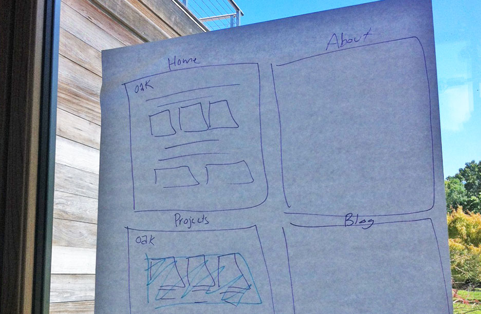
Our journey started at 10am on Friday during Oakweek with some initial discussion, rough wireframing, and a Tweet. Just like last year, we had no prior preparation.
Last year we redesigned our website in 1 week. This year we’re doing it in 1 day… starting right now. #oakweek
— oak (@oakstudios) August 24, 2012
We began by evaluating what was working on our previous site, and identifying areas to improve in the existing design. Our previous aesthetic choices had aged well so we decided to evolve the design along the same path. We kept Gloriola (that’s our jam) and our typographic hierarchy. The bright palette reflects a fresh and optimistic tone from a studio that’s having fun. We retained a simple grid structure that allowed us to easily adapt a home page, blog, work, and about pages.

Wireframing at Oakweek: a work in progress
Luckily we had a fairly decent code base to start with. We decided to keep the existing HTML structure (for the most part), and scrapped almost all of the CSS after running it through Unused CSS. Our time constraint made this a lengthier, riskier decision but the new, leaner code was worth it. The code we did retain lead to a pleasant surprise on our now colorful tag pages, thanks in part to some leaky CSS classes.
Reaffirming our commitment to our core products, Dropmark, Symbolset, and Siteleaf (which powers this website), we put them up front and center on the home page.
A page to house all of our projects was something left out of our last redesign, and one goal for this version. We love to share the work we do, but generating content and formatting case studies can be time-consuming (a big reason why it never made it into our last site). So we decided to keep it simple: one large column on the left for images and one small column on the right for copy.
Another feature we didn’t get around to in last year’s revamp was what we like to call “fuzzy navigation”—part useful, part easter egg, part I’m Feeling Lucky. Type in any word after oak.is and we’ll try to find what you’re looking for (try: design, oakweek, or Ryan Gosling). Fuzzy navigation searches site content, our custom short URL handler, as well as our bitly links. It’s experimental so try it out and you might find some surprises along the way.
“Release early, release often” is a motto we’ve learned to live by. It’s okay to build quickly, even if that means not being perfect right away. The site continues to evolve. There is still work to be done and features we’d like to add, but the current site is a better reflection of where we are now as a company.

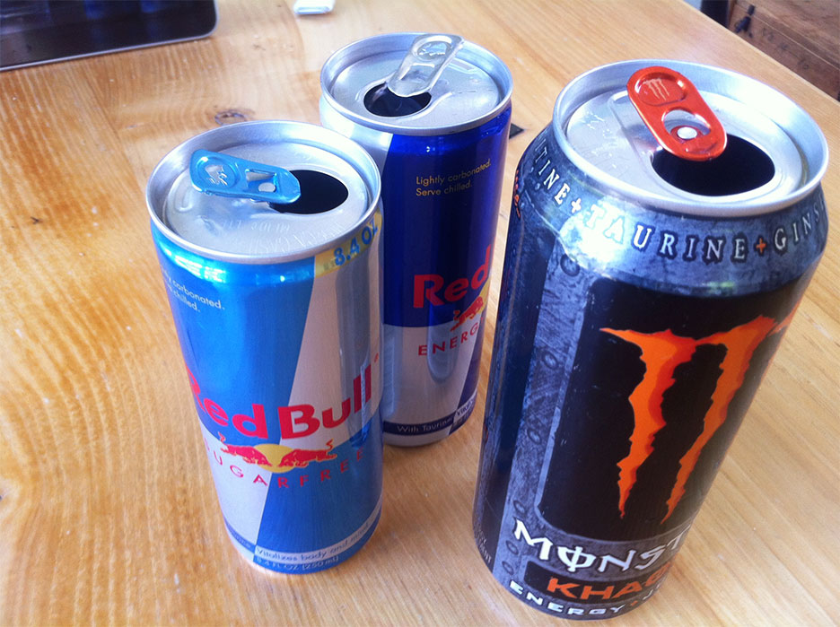
oak.is: Powered by Siteleaf and Red Bull
Oakweek culminated with the site launch at 7am Saturday morning. 21 hours filled with designing, coding, pool breaks, BBQ pizza, dark ’n’ stormies, Netflix, Red Bull…and 3 hours to spare.
21 hours later, the result of our 1-day site redesign is live: oak.is #oakweek #redbull
— oak (@oakstudios) August 25, 2012
Does all of this sound fun to you? You are crazy. And you should join our team.